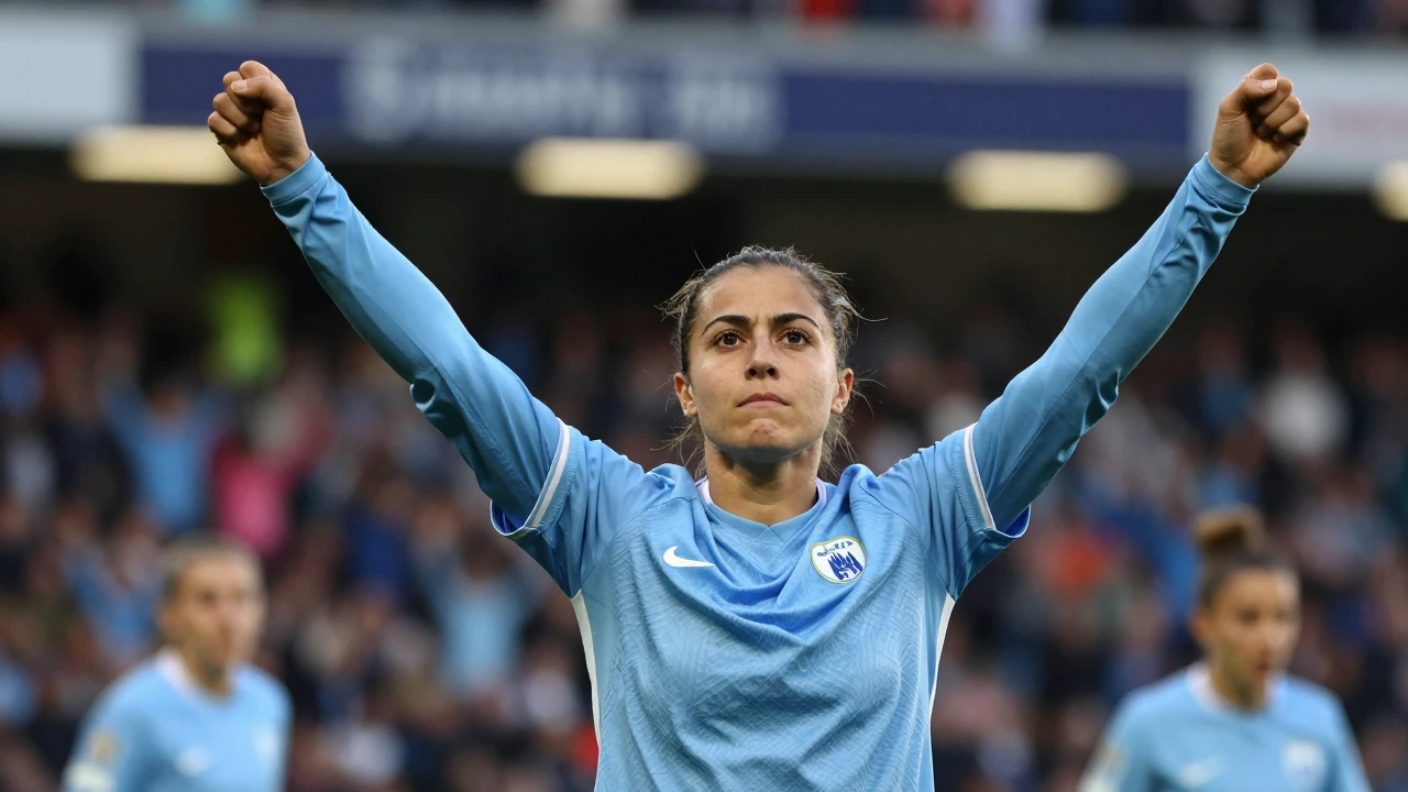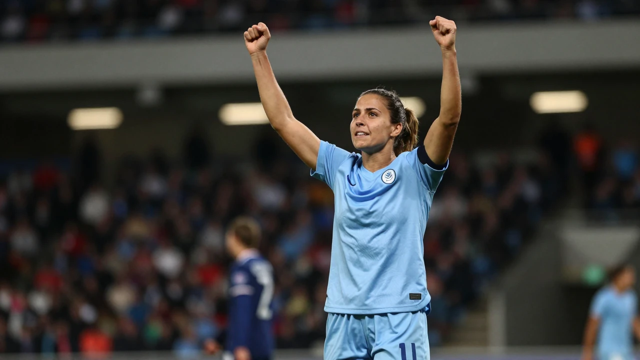

Manchester City Women have become the first club in the Women's Super League to launch a brand identity separate from their men's team. The new visual identity, created by football-focused design studio Nomad, features a monogram of the letters M, C and W described as being 'made of light' and will be rolled out across retail and other applications.
Sally Sheppard, the director of marketing, stadium revenue and fan experience at Manchester City Women, said the move was necessary. "It became really clear that we needed a more consistent way to tell the story of the women’s team," Sheppard explained. The rebrand includes the tagline "It takes a city".
A design for a new audience
Club research identified three core audience groups: men's-first fans, women's-first fans, and those equally interested in both teams. The women's-first segment was found to be predominantly women, younger, often families and frequently part of the LGBTQ+ community. This insight directly informed the creation of a distinct visual language for the women's side.
Natalie Doto, creative director at Nomad Studio, highlighted the studio's history in the women's game. "In 2017, we rebranded the FA WSL, a milestone moment for women’s football and the start of a much bigger shift," Doto said. The studio was subsequently commissioned to undertake this landmark project for the reigning champions.
Building on historic success
The new identity arrives as Manchester City Women build on a historic 2025/26 campaign where they achieved the domestic double, winning both the Women's Super League and the FA Cup. That success has carried momentum into the new season. Gareth Taylor's side currently sit second in the WSL table with three points from their opening game, a 3-1 victory over Birmingham City Women last weekend.
Mary Fowler opened the scoring in that match before Khadija Shaw netted a brace, with assists from Kerstin Casparij and Beth Mead. The strong start underlines the club's ambition to defend their titles, a challenge detailed in our standings tracker.
The future rollout
The distinctive monogram will now begin appearing across the club's touchpoints, from merchandise to digital platforms. This visual separation marks a significant step in the team's journey, recognising its unique identity and growing fanbase separate from the storied men's side. The project was documented by the design publication It's Nice That.
With a perfect record so far this term and a fresh brand to rally behind, the focus returns to the pitch. The squad, which you can explore on our squad page, next prepares for their following WSL fixture as they aim to maintain their early position at the top of the league.